Last week Facebook decided this was as good a time as any for its global mobile users to download it’s dedicated messenger app. They promptly turned-off the messaging feature within the main Facebook app, and decided to let fuzzy cartoon animals break the news to users. While we’ve seen this coming a long time, it still didn’t do much to dull the annoyance many users felt – myself included.
A lot of you, like me, hadn’t felt the need to inflict Facebook’s standalone messenger upon your already strained smartphone. Between the default texting apps – iMessage/Hangouts and the single-feature Apps like WhatsApp, Line, Skype and <insert your go-to messaging app here> – it’s quite reasonable to assume that we really didn’t need this new app that does exactly the same thing, albeit with a possibly wider, more carefully curated circle of friends.
A lot of brands are taking this route, often based on the understanding that users associate each mobile app, even the popular ones with typically just one or – if they’re lucky – a few key functionalities. While unbundling divides an app’s hard-won user-base between multiple apps, marketers and company bosses hope the headline features can stand on their own strengths and even succeed in drawing in more users helping brands focus their services even more effectively in the long run. This is all about the bigger picture, just like we saw when recently Fourquare spun-off check-ins to its new Swarm App.
But, is it really in the interest of the users? I’ll venture 5 key reasons why this really isn’t a good strategy.
- Stiffer Competition – Quickly now, name 3 apps that support chat on your phone. There already? Alright, name 2 more. A bit harder, but you’ve probably got five names of popular chat apps. The story is pretty much the same with a lot of other apps – you don’t get to over 1.2 million apps on the App Store without having a handful of close substitutes. When pitted against mature single-feature apps, newly unbundled apps tend to quickly lose their sheen when they’re plucked from the protective embrace of their nurturing parent app.
- Clutter – There’s something to be said about having to swipe back and forth between mobile screens littered with apps and a bunch of folders before you finally stumble across that sneaky app you’ve been hunting for. Even despite the occasional spring cleaning, smartphones are apt to get bloated with too many apps weeks after they’re unboxed. Chances are, the parent app, like in Facebook’s case notches a spot on the home screen, while the lesser siblings get relegated into the wilderness of many apps – rarely ever seen again, and – out of sight is out of mind.
- Power to the people – This one I especially find hard to digest – how some brands don’t bother softening the blow to their users, it’s how they take choice out of the equation. When apps unbundle and we are left with no choice, are we still in control? Wouldn’t it make a lot more sense to continue support for a low-fi version of the feature while reminding and enticing users about the awesomeness awaiting them on the standalone app? Rather than the more ham-handed approach of ‘what you’re looking for is over there now, go fetch!’
- Resource Economics – Basic economics, unlimited wants and needs but limited resources – also so true with mobile phones today. Your smartphone despite its incredible specs is often barely able to last you the day. Prompts, alerts, badges, banners and all those other jiggers love to play fast and loose with your battery unless you’re careful. If apps keep unraveling as they are doing today, chances are you’re devices are in for tougher times ahead. Devices today beg for a more efficient use of their resources – power, network usage, push notifications, storage – just to name a few areas that need urgent assistance while we await better tech innovations.
- What did Mobile do to deserve this? – Wasn’t the original promise of going mobile letting users have the same desktop experience they’ve come to love in an even more seamless and intuitive way on the go? Why must brands throttle, split, twist and maim the desktop’s features when they make the jump to the smaller screen? It would be sad if we found ourselves gravitating towards the web version of websites in-spite of these otherwise brilliant apps, just because thats the only way we can stave off that 60MB app download over mobile data.
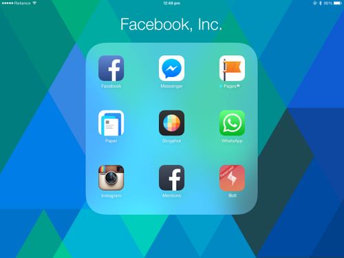
Meanwhile, I’ve arranged all of Facebook’s iOS app offerings into a folder. And once Instagram’s new Bolt app arrives on iOS (as of this article on a limited release in few Google Play Store markets), I’ll probably need to make a new folder to accommodate the growing Facebook, Inc app influx.
Bonus quiz: How many billions in Facebook acquisitions do you count between those icons?
